Hello Friends!
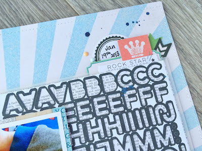
Today's layout share is another Scrapbooking Memories magazine Masters Challenge layout..
This challenge was sponsored by American Crafts, and they sent us the Dear Lizzy Documentary Collection to create with.. Pretty much the Entire collection!! I had no idea where to start as there was endless ideas! AC products are my go to 'brand' for creating with
Here's what I came up with
At the time of creating this I was really inspired by so many circle based layouts. I liked the idea of a scattered diagonal layout made up of clusters of different sized circles, mixed with a few smaller shapes.
I raised some with foam tape, sewed some down for dimension, and layered in smaller pieces in different shapes
Theres always a doily poking out of somewhere.. I can't help it! I also sewed a rough border around the area of the photo stack, just because :)
I love the colours that are within this collection. Pastels and brights all mixed in together make my heart sing
This title actually took longer to make then the rest of the page! I couldn't decide what to use, where to put it, what to say or even if it needed it at all. I came up with this, and am really happy with the end result.
Thanks so much for stopping by today, be sure to keep your eyes peeled over the next few days for some exciting scrappy news!!
For now, Happy Scrapping
Michelle x
Collection - Dear Lizzy Documentary
Products used - 12x12 Paper pad, Die cut ephemera pack, Sticker sheet, Puffy Stickers, wood buttons
Other - American Crafts Zazz Gold glitter glue, ‘Noted’ Thickers, Doily, Vellum, Gold Color shine, Gesso, machine stitching


