Sunday, July 31, 2016

PJ Days | Mastering the Art - Feature Article Part 2

Hello! I'm back to share the second layout that was made for my Feature Article in Scrapbooking Memories Magazine. If you would like to read the full article, you can find it in Issue 19.03 on pages 42 & 43. 

For this layout Ive used the Totally Rad collection along with a pop of pink from Free Spirit. Both collections are from Cocoa Vanilla Studio. I love how versatile all the collections are, and how easy a masculine collection can be used for a feminine layout.

Again like the layout in the last post, I've repeated colours and embellishments within each cluster to give balance to the page. Creating clusters within a visual triangle and/or scattering embellishments across the page in diagonal lines helps to guide the eyes attention to the focal point of the page.The photo or memory that you're documenting!

I've used a range of embellishments from this collection, so many to choose from!

Can't get enough of that cute face!!

Sometimes I like to mix stickers, die cuts and sometimes stamps to create large titles. 


And thats it!

Thanks for stopping by!
Until next time, Happy Scrapping.
Michelle xx

Collection - Cocoa Vanilla Studio ‘Totally Rad’

Products Used - Papers, Die cuts & ephemera, Acetate stars, Alphabet & accessory stickers, enamel shapes, Woodies

Other Products used - Free Spirit collection paper, American Crafts cardstock & vellum, D-lish Scraps doily, Black Ink, Machine Stitching, Roller stamps, October Afternoon alphabet stickers, staples

Birthday Girl | Mastering the Art - Feature article Part 1

Well hey there! 
I'm back with another Masters Layout share.

This was created as part of a 2 page article featured Scrapbooking Memories Magazine. My topic was to discuss ways that I create a theme and balance embellishments within my pages. If you would like to read the actual article its on page 42 & 43 of Issue 19.03

I chose to create use Cocoa Vanilla Studio collections only for both layouts, as I am OBSESSED!!  I just can't help it lol The quality and choice of products is by far the best I've used in the many years I've scrapped. What makes it even better, is that it's an Aussie based company. And I do love to support home grown, talented crafty Mumma's!

Anyway, lets get back to the layout share shall we? 

This is what I created..

I've used the Free Spirit Collection for this layout documenting a sweet memory from Leila's 5th birthday. I loving friend of mine from work left a little surprise on the doorstep that morning. Leila Loved it! 

I kept the layout pretty simple with clusters made from a wide range of embellishments within the collection. I repeated embellishments within each cluster and balanced out the colours used 

Here's some close ups..


Thanks so much for stopping by, 
Layout 2 will be up soon
Michelle x

Collection - Cocoa Vanilla Studio ‘Free Spirit’

Products used - Papers, Die cuts & Ephemera, Alphabet & Accessory stickers, Blooms, Flair button, Woodies, Wood veneer, enamel shapes, Fancy buttons

Other Products used - American Crafts cardstock & vellum, D-lish Scraps doily, Gold Color shine, machine stitching, typewriter, staples

Hello London | Masters Challenge 7 - Graphic 45

Hi Scrappy Friends

Today Im sharing a closer look at another Masters Creation for Scrapbooking Memories Magazine.
This was for the Graphic45 Challenge


I seriously thought I was going to struggle with this challenge. Graphic45 is not a manufacturer that I gravitate towards due to its vintage inspired colours and patterns. However, the pack we received to use for this challenge was CRAZY! So much stuff!! One collection that stood out as a definite winner for me was the Cityscapes collection. Its theme was travel based, and the colour palette was something I knew I could work with.

Here's what I came up with..

Back in 2008 Mum and I, along with my Grandma, took the overseas trip of a lifetime! So many memories from this trip and Its all been scrapbooked. But this collection gave me the perfect opportunity to go back in time and scrap the more cherished photos (better than I did years ago)

I took a photo of mum in front of London Bridge and worked some magic. I know I say it all the time, but I really do love how this turned out. 


I didn't need to do much more than layer and cluster cards and chipboard shapes from the collection with some buttons and flowers from my Cocoa Vanilla Studio stash


I typed the journalling out on vellum as it blended nicely with the vintage feel of the page, then splattered the area with some gold color shine. I've tucked some tabs into the paper layers for added interest and to balance the colours of the layout.

Thats all for this challenge
Until next post
Happy Scrapping
Michelle x

Collection - Graphic45 Cityscapes
Products used - 12x12 & 6x6 paper pads, ephemera card, cardstock stickers, chipboard pieces, tags & pockets.

Other Products used - American Crafts cardstock & vellum, D-lish Scraps doily, Cocoa Vanilla Studio Blooms & Fancy buttons, Gold color shine, Machine stitching, typewriter 


Saturday, July 16, 2016

Happy Memories | The Cut Shoppe

Hi Everyone! Today I'm sharing my second layout for The Cut Shoppe this month. And gosh is it my favourite so far!

I've chosen 2 cut files for this layout and a super cute photo of Leila on her first birthday. 

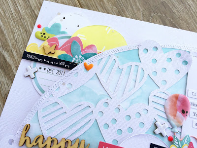
I love making a statement with cut files on a large scale, so for this layout Ive selected one of the half circles from the Sassy Circles 12x12 design and increased its size to almost a full 11x11 circle, then cut it out. I've also used the NEW Hello Hearts file by duplicating and welding together to create a larger strip piece. This made it perfect for layering between the half heart circle and pattern paper.


After adding the extra layers of pattern paper, the other cut file pieces and sewing around the edge a few times, I decided to go one step further by cutting it out of the page completely. This enabled me to pop it up off the page with some fun foam and gave it more dimension.

Heres some close ups.. 

I replicated the circular shapes top and bottom of the large shape, to form a diagonal line across the page. I find this helps to draw the eyes attention to the main focal point of the page, but then again the massive cut file helps with that too LOL

I've given the title a light covering of glitter using a clear Wink of Stella glitter brush rather than leaving it plain or colouring it. Who doesn't love a hint of sparkle? 

I always try to add some form of journalling on my layouts, lately I've been doing so with my trusty old typewriter. I really do like using my own handwriting, by theres something about the clean, crisp look of typed writing.

Loving the hearts cut file! And that cute little face..

And one last close up of the bottom cluster. All papers and embellishments are from a Hip Kit that I've been holding onto for a little while. The colours and designs are so bright and happy!

Thanks so much for stoping by today, Be sure to check out the Shop for all the new cut file designs released this week!

Until next time, Happy Scrapping x


Friday, July 15, 2016

Snapchat Fun | D-lish Scraps

Hello Hello! Its Cybercrop weekend in the D-lish Scraps Scrap Suite and I'm here to share my challenge. It's a fun one ;)

I hope you've got some silly selfies ready to scrap.. 

We love Snapchat selfies here, Especially Leila. But hardly any of them get shared with friends.. until now LOL

I've combined a few of my favourites within this layout. 
A new cut file from The Cut Shoppe "Washi Love" 
Strips of papers from the "Totally Rad" collection by and a pop of pink from the "Hello Lovely' collection, both from Cocoa Vanilla Studio
And a scattering of D-lish Scraps embellishments 

I coated the page pebbles and speech bubble with white paint prior to adding a touch of silver glitter. Then grouped them together with some of my favourite paper flowers, a wood button and an enamel heart. I added a Journal it tab for an extra pop of pink

The song "You're so vain" comes to mind each time I see this photo of myself.. purely just for fun and totally staged HAHA and because the photo's we had prior to this were terrible!

I've teamed the 'Fun' veneer with some alphas from Kaisercraft, both from the D-lish store
and another cluster made up of an altered page pebble, paper flowers, enamel dot and a sequin bow

and lastly the bottom cluster made from more paper flowers, another page pebble, wood button, enamel heart, Journal it tab and minifetti strip

Thanks so much for stopping by, I hope you can visit The Scrap Suite and check out the other challenges we have to share with you all

That's all to share for now, until next time
Happy Scrapping!

Michelle xx

P.S Here's a look at the Cut File I used along with 3 others that have just been released in The Cut Shoppe store this week.. So many possibilities!


Thursday, July 7, 2016

Hello There | The Cut Shoppe Blog Hop


Hello and Thanks for joining in on The Cut Shoppe Getting to know you Blog Hop!
Hopefully you've made your way from Monique's blog and are ready to get to know me a little more..

Welcome! I'm Michelle, a 30 something mum of one. I live in Geelong, Australia with  my Fiancé Clinton and our 5 1/2 year old daughter Leila. I've been scrapbooking on and off for over 10 years now, more so in the last 5 years since having Leila. I feel so honoured to be part of The Cut Shoppe team for the next 12 months, and am very excited to continue using and sharing loads of cut file fun!

A few more things about me..

How many times in a week, do you work on something scrapbook related?
This is very dependent on the week.. Weeks that are quiet = creating something every day/night. Compared to weeks that are crazy solo parenting weeks (while Clinton is away for work) I'm lucky to have a few hours spare to create.

What’s your favourite subject to scrapbook?
Thats easy, and I'm sure most of you who follow me can work it out too. Leila.. The good the bad and the downright ugly moments have all made their way onto a page, or into her Project Life albums

What is your favorite color to use on your layouts/projects? What is your least favorite color?
Does white count? A majority of my layouts consist of a fair amount of white cardstock thats generally mixed with pinks or blues. It's not often that I use Red or Brown.. but sometimes it sneaks in there.

Why do you like using cut files on your layouts/projects?
I like using cut files on layouts as they bring a different look to a layout. They can completely transform and personalise a layout while adding details and texture. 

What are some of your other favorite hobbies? If you were not a scrapbooker, what other hobby do you think would consume most of your time?
Scrapbooking is the main hobby that I dedicate time to. I do enjoy sewing and crochet, reading books and watching endless amounts of TV.. oh and Coffee.. is coffee a hobby? It should be lol

Tell us 5 things we don’t know about you!
- I lived at home with my parents for over 30 years (Insert silly face emoji of some kind) This is a seriously long story for another time and place. We are all very thankful for the roof over our heads while we saved every penny we could to build and move into our very first family home. We've been in our 'new' house now for exactly 12 months and I wouldn't change any part of the journey along the way!

- I'm adopted, and I've never met my birth parents. I actually know nothing about them, other than a few minor details about my birth mother that aren't helpful in tracking her down if I ever felt I needed to.

- In person I can be quite shy/nervous/anxious. This is sometimes mistaken by people as me being rude, however I'm normally struggling on the inside to think of things to say. That is until I get to know the person/people I'm with and then I can become quite the opposite...

- I'm crazy for organising things.. shelving at work, other peoples craft spaces, pantries etc. I can plan it all out and assist with the changes.. However to try and do this within my own home is a nightmare! I am so indecisive of things within my own spaces lol

- I constantly second guess myself.. I've achieved so much in my creative life in the last 12 months, yet I still don't think I'm worthy enough..

Anyway.. enough about me! Let's have a look at something creative shall we?  


I've made a new layout for this hop and I LOVE how its turned out! That face... So Sweet, yet so very cheeky!!


 I've used the Half Hearted 12x12 file to create the background and the 'Hello There' title came from the new Everyday Essentials file.


To start the page I opened up and traced the 12x12 Half Hearted cut file in 12x12in size, then removed full hearts in random places around the page to leave some empty spaces. Once cut, I used the cut pieces to create raised hearts in the empty space. I've used papers from the Cocoa Vanilla Studio 'Free Spirit' Collection to back the open hearts and the open letters of the Title piece. I've also added some hand stitching to the title, and machine stitching to random white hearts for some added detail to the page.

Here's some close ups..


So much fun!

**GIVEAWAY CLOSED - WINNER ANNOUNCED SOON**
Each of us along the hop has a $5 Gift Certificate to give away to a random winner. Just leave a comment below telling me what you like about Cut Files :) Entries are open until Sunday July 10th. Winners announced on The Cut Shoppe Blog Wednesday July 13th

I hope you've enjoyed getting to know me a little more.
Make sure you continue on along the hop to meet all the other designers, and don't forget to leave a comment for a chance to WIN! The next Designer to visit is ZINIA AMOIRIDOU.
However, If you've started fresh from here and would like to start back at the beginning head over HERE

Heres a look at the Full Hop Order:
MICHELLE STOKES << YOU ARE HERE

Thanks so much for stopping by today.  


Sunday, July 3, 2016

Sweet | D-lish Scraps

Hi Everyone, I'm back today with my second and last share for D-lish Scraps this month. 

Todays layout was inspired by this challenge set by Sue, for the June Cybercrop
I liked the circles idea of the challenge, and knew I'd be able to find a speech bubble somewhere. I've used another photo of younger Leila, and pretty papers from the Hello Lovely collection by Cocoa Vanilla Studio. They're so pretty, and they co-ordinate so well with the yumminess within the D-lish Scraps store.

Leila has been a lover of creativity from a very early age. With 2 creative parents it was bound to happen. The photo I've chosen is on one of the very first times she actually sat still long enough to draw/scribble a few tiny lines on some paper, while mummy was crafting. 

I love that chubby little face!


For the Main cluster Ive grouped together a mini doily and journal it circle, tucked behind the photo and paper stack, a pink sequin bowfoil Flair button, a mix of paper flowers (Pastel petals, Forget Me NotsCarnations and Cherry Blossoms) and a sprinkling of enamel shapes

At the top I've created a mini cluster with a few more enamel shapes, a Journal It ticket, paper flower and Cocoa Vanilla Studio Veneer..

Then along the bottom of the page I've made another mini cluster with some more enamel shapes and a pastel petal flower, along with more Cocoa Vanilla Studio die cut shapes and the Title.


Thats all for my D-lish Scraps shares this month. Thanks so much for joining me
Until next time, Happy Scrapping x


Saturday, July 2, 2016

Always Cheeky | The Cut Shoppe

Hi Everyone! Today I am SO EXCITED to share my very first layout for The Cut Shoppe. What an honour it is to be part of this extremely talented team of crafty ladies!!

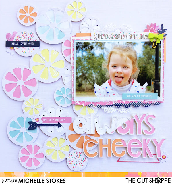
For this layout I wanted to document a cheeky moment shared with my 5 year old Leila. Being an only child (so far) she's the star of most of my layouts. Always willing to pose for a photo or ten, but never ready to smile nicely. I'm sure a few of you out there will understand the fun and games to be had when wanting just One nice photo.


I chose the Fresh Squeezed cut file purely for the shapes that I could alter and move around into a more random, open background. The inside of the shapes reminded me of flower petals, and I'm a sucker for a 'floral' design. 

I've used papers and die cuts from a recent Hip kit to back the shapes and embellish the page with. A bright and cheerful reminder of warmer days, especially when its so so cold down under!


The second cut file I used was the Open Letter Alpha for the title. I've welded the letters together to form the words, then cut and backed with more pattern paper from the same kits.  


Thats all from me today. 
I hope you have enjoyed seeing my first layout share, and that you find some time to get creative real soon. 
For now, Happy Scrapping x