Monday, September 25, 2017

Dull your Sparkle | Cocoa Vanilla Studio

Hi Scrappy Friends! It's Michelle back here today with a new layout share featuring one of our sweet new Limited edition collections - One in a Million. The colours within this collection are so soft and very pretty, and worked so well with this hilarious photo of Leila from a few weeks back. 


This child of mine is completely crazy, all kinds of hilarious and so much fun! Her latest craze is running around the house with a set of her Dad's ear muffs on for no particular reason other than to make us laugh. So much laughter. 

To create a layout to best represent the photo and its subject, I went a little crazy myself with banners and flags and layers and stuff. Starting with strips of almost all the papers within the collection kit, thick, thin, long and short plus pieces from the Cut apart sheet. So many layers and probably too many details added, but it was a fun creation that came together in no time. 


Once I worked out the placement of all the banner pieces, I strung some twine across the tops added some loops and adhered with staples. I tucked in pieces of ephemera and added some sticky dots for dimension to corners of the banners. I even added some fussy cut butterflies and a flair button from the kit.


Ive used the 3x4 card "Don't let anyone ever dull your sparkle" as the title as it's exactly how I feel about this girl. I hope she's always as fun as she is today, and that no one ever makes her dull her 'sparkle'. Thats what makes her who she is.


I added in the heart to balance out the pink tones across the page and to add a different element other than a banner


Lastly some handwritten journalling and a mini cluster at the bottom of the layout and I called it done.


So many fun pieces within this collection. If you managed to score one before they sold out, please be sure to share what you make with us! 

Thanks so much for stopping by today. I hope this has given you some inspiration to get a little crazy with banners!

Until next time, Happy Scrapping
Michelle xx

Saturday, September 23, 2017

You COLOUR my world | D-lish Scraps

Hello Hello! I'm back with a new layout share for D-lish Scraps inspired by the current Over the Rainbow Inspiration board. For this creation I've used this months Just add paper kit and a bunch of paper punches I have neglected for so long. I've been inspired by so many pages in the last few months that have used this technique so I thought I'd give it a try. 


I had the perfect photo ready for this layout, one of Leila from a couple years back that I'd recently re edited using a fun app on my phone called Color Pop. The app allows you to create a black and white photo with parts in full colour. So fun! 


The colours of Leila's dress are the best mix of Rainbow, which are perfect for using with this months Just add paper kit. The selection of goodies this month is full of pretty pops of colours that perfectly compliment each other in every way possible. 

Heres a look at the full kit if you haven't seen it at all this month...


Quite a few of my favourite items within this kit - journal its, a sequin bow, paper flowers, flair buttons, an awesome yellow tag, some fun washi tape and more!


I left the large wood veneer raw as I felt it would blend into the background if it was any other colour.  You can also see a close up of a few punched designs Ive used to create the strips along the background. I fussy cut the yellow label from the journal its pack and tucked it into the strips. I've also adhered the glitter heart to the layout using foam tape as the back is slightly curved and wouldn't hold using regular tacky glue.


To the right of the photo I created a cluster using the Sequin bow, 2 of the paper flowers, a flair button, flower button and some of the pretty faceted enamel dots from the store


I've added a couple of lines of journalling under the strips, something I'm really enjoying seeing on my layouts more since my typewriter stopped working.


Lastly I felt the top of the layout needed a little colour so I created a cluster to balance it all out. I;ve used a journal it from the kit, some remnants of the strips from the centre of the layout, a tiny strip of washi tape, a button and more of those pretty faceted enamel dots. 

Well thats all from me today, I hope this has given you inspiration on how to get use from this months Just Add Paper kit. Please be sure to share your creations made with D-lish Scraps goodies via our Facebook group The Scrap Suite, we love seeing what you all make 😍

Until Next time, Happy Scrapping!
Michelle xx

Monday, September 11, 2017

One of a Kind | Cocoa Vanilla Studio

Hello Hello! I'm Back today to kickstart a new week of Inspiration for Cocoa Vanilla Studio featuring all things STICKERS. We're talking accessory stickers, chipboard stickers, alpha stickers and even washi tape stickers. I'd even consider the sweet enamel shapes as stickers - they are sticky lol

For my layout share today I've used the amazing new collection Bohemian Dream. If you're a follower of our Facebook page and Community group you would have seen the MOUNTAIN of boxes in a shipment that Zoe has just received. It has arrived! WOO HOO. It may take some time for it to load into the store, so for now you can drool all over the prettiness shared here ;)


This collection is absolutely Stunning, and has absolutely surpassed my obsession for the Make a Wish collection. I'm loving the bright pops of colour, mixed with soft water colours and darker prints. The sweet floral designs are perfectly pretty and those hearts.... so cute! I've chosen the photo of Leila purely for the colour of her shirt that ties in with the colours of the collection.

I've created a grid style layout using a selection of papers from the 6x6 paper pad. I cut 2x2inch squares and arranged them randomly before sewing around or through each individual square.


I backed my photo with another 6x6 pattern paper, the 6x6 version of the Abstract paper that I'd cut into 2 triangles for a different project but didn't use. I layered the photo into the corners of the paper and cropped the excess off. I also layered a cut apart piece behind and an accessory sticker before raising it up with some foam for dimension.


Now I'm not sure about everyone else, but I consider my Accessory sticker sheets an extension to my die cut ephemera packs. They're perfect for layering in clusters and adding a finishing tough to empty spaces, and sometimes even being used for Title work. So many sweet sentiments and those chipboard stickers give some great dimension to a page!

With all this in mind my next task was to create a large cluster with as many stickers as I could, without over doing it. I used the "One of a Kind" piece from the sticker sheet as my title for the layout, and raised it with some foam tape to make it stand out more. Tucked in under and around this are more accessory stickers, a large floral chipboard sticker, a couple of chipboard sticker hearts, enamel dots and some ephemera pieces.


Once I was comfortable with the main cluster, I worked on all the mini clusters using more Accessory stickers and enamel dots. I selected random squares to fill within a visual triangle to create an even flow of embellishments in an already busy background. I also added in a few ephemera pieces to compliment the added colours and stickers.


All of the little word stickers and strips are perfect for documenting a 'just because' layout of Leila, with each one singing out sweet little sentiments I want her to remember in years to come.


Thats all from me today. I hope this has given you some inspiration to go crazy with stickers! I know it has for me :)

Until Next time, Happy Scrapping!
Michelle

Friday, September 1, 2017

Fine & Dandy | Scrap the Girls

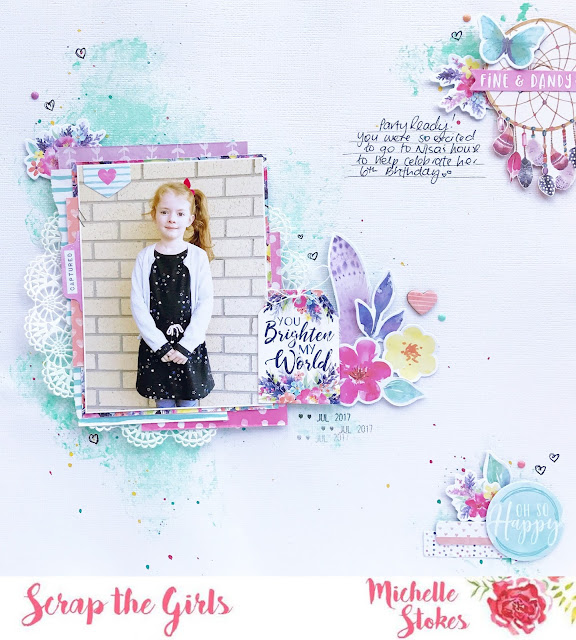
Hello Hello! September already = its time for a new challenge with Scrap The Girls. This month is a cool sketch that challenged me to get a little messy! I've used the STUNNING new collection from Cocoa Vanilla Studio - Bohemian Dream, which is not in store as yet, but a sneaky little birdie dropped me off a package while they were visiting for Paperific and I couldn't wait to dig in to it all!


LOVE LOVE LOVE the colours within this collection, and all the pretty designs! The perfect collection for scrapping photos of Leila. 

Heres a look at the sketch designed by DT member Sue


I got a little messy on the background with some coloured paint and scrunched paper towel, plus an extra added sprinkling of colour with some Kaiser Mists. I even drew some mini hearts with a black pen

Heres some close ups of all the sweet details


Thanks so much for stopping by. Ive left this super short today, but I aim to pop back in and leave links to all the items once the collection goes live in the Cocoa Vanilla Studio store. 

Until then, apologies for all the creative spam ;)

Happy Scrapping
Michelle x